
As an interlude to our ongoing series about the mechanics of data, I’d like to reflect upon a recent data workshop I attended. Organized by the Minnesota Council of Nonprofits and Karen Graham of Idealware, “Nonprofit Communicators Workshop: Wrangling Data to Drive Decisions” was a unique opportunity to hear other professionals’ perspectives and questions about data. And what I heard echoed precisely this: You don’t need a Ph.D. to use data!
Again, for those in the back: YOU DON’T NEED A Ph.D. TO WORK WITH DATA!
What you do need is a plan that works for you. In this blog post I’m going to highlight what I thought were the most immediately applicable pieces of advice conveyed. Primarily: creating a plan!
Often data is requested by funders who are not entirely sure of what they are specifically looking for; they just want “metrics that show progress.” So the first task is to decide how progress will be measured. Once the definition of progress has a bearing, we can better answer questions about what data is important, what data isn’t important, and why.
Al Onkka of Aurora Consulting gave a presentation that provided two key graphics. This first graphic (used with permission) outlines the “Inquiry Cycle”: Question, Investigate, Reflect, Use.
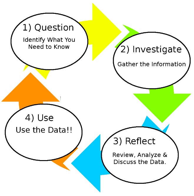 Too often an organization will start with a mound of data and attempt to find a way to use it all. Al encourages us to pursue an opposite path; by creating a plan, we first outline the question for which we seek answers, and the metrics for those answers. How many clients are served? How many emails are opened? Which emails are opened? What correlations may exist between donor revenue and organizational procedures? We are then able to discern what data is necessary and how it might be gathered. This method of engaging data alleviates many other frustrations down the road, while allowing for continued expansion of one’s data use.
The next graphic, also courtesy of Al from Aurora Consulting, illustrates the spectrum of data one might gather. Often data becomes intimidating because it appears disorganized; rows and columns of numbers are not usually considered entertaining visuals. Where does one begin?
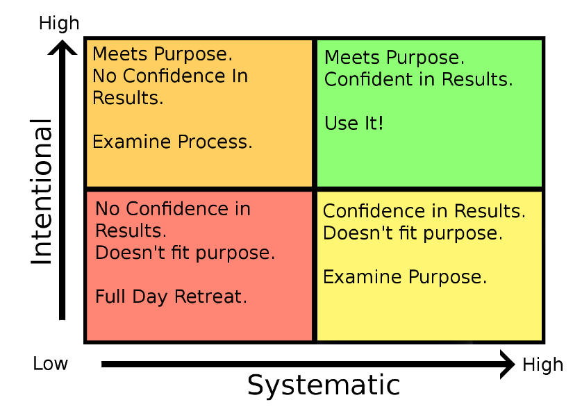
This graphic provides a quick and simple analysis of what types of data you may be looking at, and what to do in each circumstance. If you have already created a data plan, hopefully your data has been intentionally collected, in a systematic manner. Otherwise you may need to re-examine your data collection process or the purpose in collecting the proposed data. Either way, after finding out where on this graph you are situated, you can plot a path forward.
The last piece of insight I’d like to share are the ingredients of a good data-centric story as relayed by Kylie Nicholas of theImproveGroup, which are as follows: data, visuals, and narrative. Our primary concern is that the data is accessible, concise and poignant. This means our data is relatively easy to interpret and speaks to our topic quickly and directly, while highlighting impactful conversations. From the Inquiry Cycle we were able to pinpoint the questions to which we seek answers before we start collecting the data. This, hopefully, better enables our results to be what we need, and primed for our next ingredient: visuals.
Quickly becoming a central medium for communication, data visualization, in all of its forms, is an expansive topic. Harvard Business Review has a concise yet extensive overview of Visualizations That Really Work which discusses types of visuals, their purpose, and their components. This is an incredibly informative read, and leads to the last component of visuals: creating them. One of the more pervasive difficulties is finding the right tools to build stellar visuals! Here are a few applications to check out:
Adobe Spark – This is a free utility for making videos. There is an an app for iPhone, and a dashboard on the internet.
Animoto – This is a low-cost utility to build videos.
Canva – This is a platform to great graphics. Free.
Flat Icon – This is an incredibly large collection of icons; many are available for free, more for purchase.
The last aspect of a good data-centric story is narrative. We have our data points, and we have the capacity to make awesome visuals — but what is the thread that ties them together? This is our narrative. You’ll have to come up with this yourself. Though if we’ve followed the Inquiry Cycle mentioned above we ought already have a few stories in mind.
Considerably more information was conveyed at the event. Hopefully, though, this has been a productive distillation. The primary takeaway is to not be intimidated by data! Start by deciding what questions you want answers for, and why; then begin gathering the necessary data. Minnesota Council of Nonprofits is partnering again with Idealware to provide a “Toolkit Series” of webinars at the beginning of the new year. For those wanting to further their understanding of technology’s role in organizational growth, this series looks to cover all the necessary bases. Thanks for reading this post, and a huge thank you to Al Onkka for letting me reproduce his graphics!


 thedatabank, gbc is technology for change, and we walk the talk.


Great article! Frequently folks are intimidated by the concept of analyzing data because they don’t know where to begin. This is a great reminder that you need to know what you are trying to accomplish before you “dive in”. Great post.