
I recently attended a great session hosted by MAP for Nonprofits and presented by Marketing and Mobile Strategist, Curt Prins called “Mobile Email Optimization for Nonprofits”. I love going to sessions like these because the information is not only helpful for my work, but also for sharing with our clients and readers.
The most striking fact that Curt shared during his presentation about mobile phone usage was “there are more mobile phones that toothbrushes in use on Earth.” According to statistics that Curt shared, 43% of all email is viewed on a mobile device. Did you realize that nearly half of the people you are emailing are seeing your emails on their phone?
Many people, we are also definitely guilty, compose their emails for desktop viewing, while mobile viewing is simply an afterthought. However, you should be doing just the opposite. Mobile screens have more viewing limitations than desktops, and you don’t want to risk a large percentage of your recipients not being able to effectively read your message – especially when there are some minor, simple changes you can do before sending to make your emails more mobile friendly.
6 Tips for Optimizing Your Emails for Mobile Viewing
1. Format for Mobile First – This one was briefly mentioned above: don’t make your mobile viewing an afterthought. Be sure you keep your messages short, to the point, and keep your images small in number and size for quick loading.
2. Focus on the Sender and Subject Line – These two aspects are key in mobile messages. Unlike desktop messages, where the the Sender is minimized, it is much more prominent on mobile screens, so make sure it is someone (or something) that is easily recognizable. That may be your executive director or maybe just the name of your organization. Also, the subject line needs to be much shorter. You can only fit around 5-7 words.
3. Be Flexible in Your Email Design – Use a one column design, and ideally use a responsive email template that will adjust to the width of the recipient’s screen. In addition, always provide a plain text version of your message.
4. Nail the “Call to Action” – Have a clear and prominent call to action and be sure any buttons or links are easily clickable (not too close to other links or buried at the bottom of the message). Also, try using buttons instead of text links, so they are easier for mobile users to click on.
5. Track, Test, and Track & Test Again – Use your email service provider’s analytics tools to see what is popular and what is not in your messages. Be sure to view your messages on different devices before sending, and consider doing some A/B split tests.
6. Look Beyond the Email Message – Make sure any landing pages are optimized for mobile, as well. If people are coming from a mobilized form to a web page that is difficult for them to navigate on their devices, you may lose out on your call to action. Make your forms and social media sharing quick and easy to use. Try segmenting your lists according to message content for best results.
Curt shared many great insights, along with some interesting perspectives on the dwindling popularity of email newsletters. One big takeaway was that it’s important to keep an open mind about email marketing, and remember your readers call the shots when it comes to the success of your messaging. You must keep up with their preferences and interests in order to maintain a captivated audience.
What changes has your organization made to make your messaging more mobile friendly?


 thedatabank, gbc is technology for change, and we walk the talk.
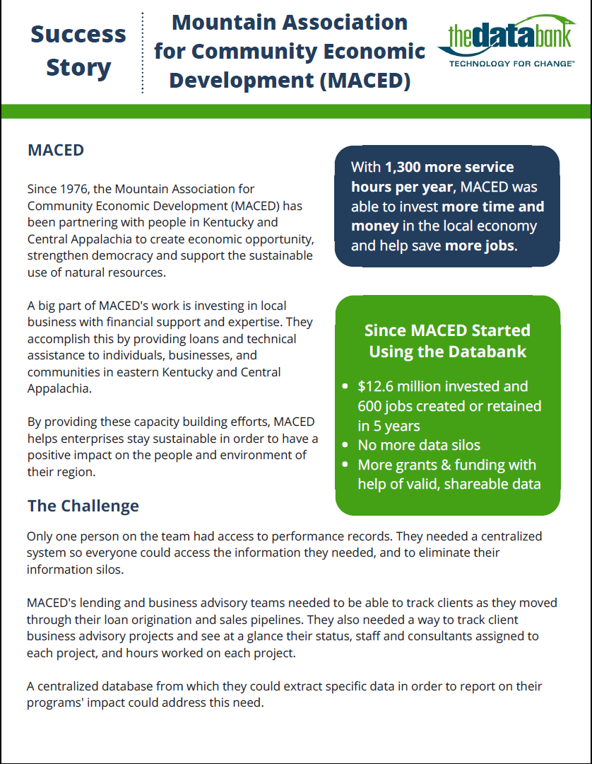


