We’ve talked on this blog a few times about how you can’t excel with using Excel as your database, but that certainly doesn’t mean that we don’t see the value in using Excel for some things – such as making awesome, custom charts!
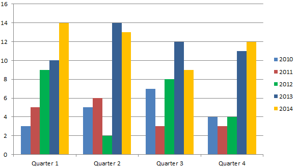
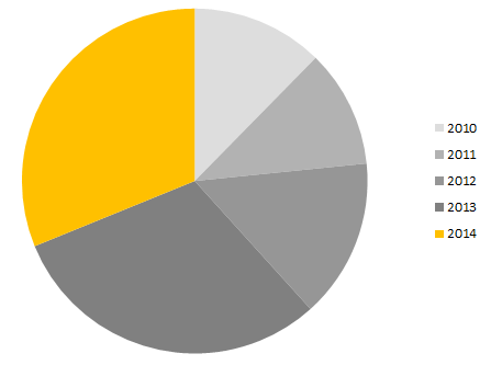
Surely you’ve seen standard Excel charts like these at meetings or in reports:

A pretty typical chart. You’ve got your quarters and your years, various numbers going on. But what is the main piece of data I’m supposed to be looking at from this mess of colors and bars? What is the focus here?
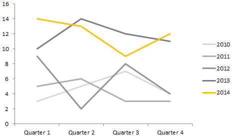
With a very simple trick, you can use this same chart to pull out the information you want people to see in a way that is easy to digest and much nicer to look at. Ready?
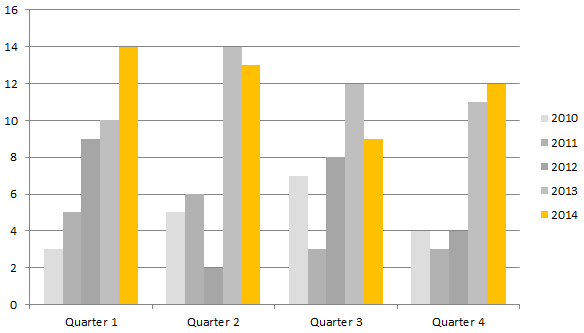
BOOM. Same chart, same info – but there’s no question what you should be focusing on in the chart. The purpose of this chart is clearly to look at the data from 2014. No distractions. The info from previous years is great for comparison, but it doesn’t distract from the main focus: 2014.
You can take it a step further too. Want to make that chart a little more minimalist? Try removing the lines.

That is lovely.
And this all took me under a minute to do. Here’s how easy it is to make these small changes:
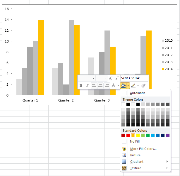
To change the color
Go to Page Layout > Themes > Colors > Grayscale
Then click once on a bar in the graph of the data you want to stand out, and it will highlight all of the bars in that section.
Now, right-click on that same bar. Click the paint bucket, then select a color.
To remove the line
Just click on a line in the chart once (which will highlight all of the lines) and hit the backspace button. Voilà!
This technique works great in other chart-types as well
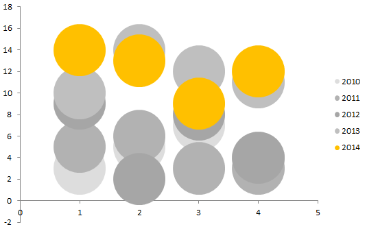
You get the idea.
These charts are great for calling out attention in board meetings, reports, or on your web site. You don’t need any advanced design skills, yet you can make a pretty chart and take a screen shot of it in just a couple of minutes.
If you’re a Databank client, there is a free export feature you can use to download your reports into an Excel file whenever you need them.
What techniques have you used to make your charts more visually appealing?


 thedatabank, gbc is technology for change, and we walk the talk.