Guest Post by Jonathan Poisner. Jonathan Poisner Strategic Consulting helps nonprofits thrive. He does that by serving as a meeting facilitator and consultant, with a focus on fundraising and strategic planning.
The phrase “Nonprofit Dashboard” is not one I recall hearing in my first decade in the nonprofit sector (1994-2004). Then, about 10 years ago, I started to hear the phrase occasionally. Around 3-4 years ago, I started to hear the phrase nearly every week.
Dashboards aren’t a fad. Dashboards have emerged as a tool because most organizations today have far more data about their own performance than their counterparts two decades ago. In addition, tools for graphically displaying data have become commonplace, embedded within programs we already use like Excel.
But Dashboards aren’t something that’s right for every nonprofit, and doing them right requires serious thinking.
So what is a Nonprofit Dashboard?
The term Dashboard is used because the tool is analogous to a car dashboard – a quick, comprehensive view of the overall status of the car. In the organizational context, a Dashboard is usually a 1-3 page document, produced on a regular schedule, which uses a combination of charts and graphs to visually represent key metrics by which an organization is evaluating itself.
While Dashboards can be focused solely on a specific program or other activity (e.g. fundraising), most organizations develop Dashboards that are comprehensive with regards to their organization.
Why create a Dashboard?
Do staff really need one more report on their to-do list?
Dashboards can serve many purposes, but the three most common benefits Dashboard proponents cite are:
- It generates strategic thinking about how the organization measures success.
- It can help to identify on a timely basis where an organization is being successful and where things may be going off course.
- It can provide a useful tool by which to focus the attention of the board on the most important things.
For really small organizations just struggling to hire their first few staff, a Dashboard is probably overkill. But at some point Dashboards become worth the investment.
What should a Dashboard measure?
There are many terms bandied about, but the one I like is Key Performance Indicators (KPIs). “Key” because you have to pick and choose since there are many metrics that matter to an organization and the challenge is to pick out a reasonable subset of them that are most important. “Performance Indicators” because you’re measuring something that’s an indicator of success.
How do you choose your KPIs?
If at all possible, the search for KPIs should begin with an organizational strategic plan, which should already identify goals and measurements of success. The challenge is to then pick which measurements are the most important to pay attention to in the next few years.
If you don’t already have these, start with your programs and ask: Which are most important? Some are more likely to be icing on the cake and others get at your core. Focus on the core.
For each program, what metrics are you already tracking (or can you reasonably track in the future) to evaluate your performance over time? For some organizations these are straightforward. A school may be tracking enrollment and learning. A homeless shelter may track people served and homeless placed into permanent housing.
For other organizations, particularly those engaged in advocacy, the search for meaningful measurements can be more complex. But every time I’ve engaged with an organization we’ve come up with some outputs that are good indicators of progress, even if they don’t represent the ultimate outcomes being sought.
Leaving programs aside, nearly every Dashbaord I’ve seen also include multiple KPIs that focus on finances – mostly on the revenue side of the equation. Here the challenge is to think through your revenue generating strategies and identify what matters most. Overall revenue is obvious. Tracking fundraising by major type of revenue (e.g. individuals, corporations, foundations, etc.) can also be valuable.
With regard to fundraising from individuals, some metrics that may be important are: the number of individual donors (or members), retention rate for individual donors (how many who gave in the prior year, have given in this year), average gift levels, the percentage of donors who have upgraded in the last year, number of donors who’ve made a second gift, etc.
Over several years, the list of which metrics you focus on may evolve – but at any given time you should look at your fundraising strategies and see what matters most.
Sometimes no one metric seems right so you have to invent something that rolls up several data points into a new one. For example, when I was a nonprofit Executive Director, we developed a long-term communications plan where progress could be measured in dozens of different ways, no one of which seemed most important.
Yet, in the end, we knew that what we really wanted out of our communications was for people to take action. So we created a new metric which we called “Total Actions” taken in response to our communications. Each quarter we added up all sorts of actions people took in response to our online communications, such as clicking on links, forwarding emails, donations, downloading documents, Facebooks shares, etc. As long as Total Actions was on a solid upward trajectory, we knew we were making progress.
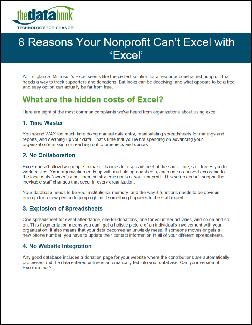
Of course, having good fundraising and/or communications data for your Dashboard presumes you’re using a valid CRM to track donations, online communications, and other data necessary to produce the metrics. If you’re still on Excel or hate your current database, getting past that hurdle should come before your Dashboard.
Likewise, the discussion about program metrics presumes that you have a means of tracking the outputs and outcomes from your programs and you put that data somewhere – whether in your fundraising CRM or in some separate data set.
The last question is: how do you display the data?
I’ve found that Excel is plenty powerful to take data and generate good charts and graphs for a good Dashboard. This may mean getting some training on advanced Excel tools. It may mean finding a skilled volunteer or paying someone for a few hours to set up your Dashboard. But once it’s set up right, anyone should be able to implement it.
It’s worth getting the Dashboard display right. If you’ve done all the work to generate and select the data, you should absolutely make sure it’s presented to your board and senior staff in a format that aids comprehension.
For those who’re looking for more information on Dashboards, I recommend BoardSource’s 2012 book entitled: The Nonprofit Dashboard.


 thedatabank, gbc is technology for change, and we walk the talk.