You just clicked send on your monthly e-newsletter sent to thousands of supporters, and the post-send anxiety is setting in. Your newsletter was crafted to relay a message, but will it get the job done? Your message is important, and so is the way you present it. Maybe you should consider presenting some of your updates as an infographic. From an annual report to a mailer, infographics can be used to relay information in a concise and attractive manner.
3 Things to Remember When Creating Infographics
Infographics don’t have to be cutesy. They can also look professional. When using infographics for a serious topic or an internal report, your infographic shouldn’t contain bubble letters and butterflies. Keep in mind colors, clean lines, simplicity, and a design that matches your organization’s style and message.
Infographics can come in many forms. Some examples of ways to deliver infographics are in: direct mailings, web pages, blast emails, and internal reports. Using different ways to express data gives the viewer a well rounded view of the information. Need some inspiration? Social media houses the largest amount of infographics, especially Pinterest. You can also check out my infographic on the right, conveying some stats about our blog.
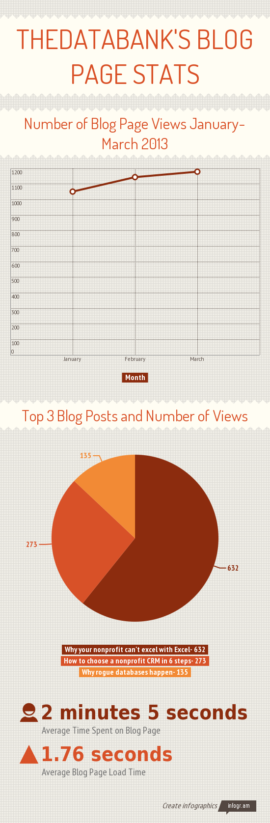
Infographics should have a clear intent. Do you want to fundraise? Bring awareness to an issue? Get people to volunteer? Don’t just fill it with every stat your nonprofit has under the sun, make sure the information you are presenting has a clear intent and has a story to tell. My infographic on the right tells a short story of how our blog has performed in the first quarter of this year.
Wait, so how do I make one of these?
There are a few infographic makers online that are easy to navigate. Although they are convenient, templates or software can make infographics look generic. As an alternative, you can create them in-house. If you have access, you can use design programs to make an infographic from scratch, hire a designer, or you can even also use word or powerpoint (HubSpot has instructions & templates to make great infographics in powerpoint). However, creating them in-house can be time consuming and/or expensive.
Infographics aren’t always the answer
As a lover of anything pretty, an efficiency snob, and marketing intern, I think that infographics are pretty neat – but there is one important thing to keep in mind: Infographics won’t always be the answer.
Infographics only work for nonlinear information. The viewer should not need a lead in, or a follow up. Infographics work best when used to communicate stand alone results. A great quote by Vin Scully that I found on the Idealware Infographics Report is: “Statistics are used much like a drunk uses lampposts: for support, not illumination.” Make sure you aren’t just listing supporting stats, but that you’re able to tell an informative story about your topic with the information you’re presenting.
Any tips to add? I’d also love to see examples of infographics that your organization has made! Leave a link in the comments below.
 thedatabank, gbc is technology for change, and we walk the talk.