Creating inclusive messaging is an important and worthwhile task, and many of us will spend the time and effort to ensure that the content of our message is welcoming and inclusive. But is the same amount of thought and consideration being spent ensuring that the delivery of the message is inclusive as well?
Over 56 million people in the US report having some sort of disability; that is almost 1 in 5 people. These disabilities can range from color blindness to full blindness to cognitive and neurological disorders. Like most everyone else, people with disabilities use email on a regular basis. Creating an inclusive and accessible environment in your emails is as important a consideration as creating an inclusive physical environment in your office and and a welcoming message for your supporters.
Types of Disabilities That May Be Affected by Email Formatting
Visual disabilities
Blindness and visual impairment affects over 20 million Americans and ranges from colorblindness to full blindness. Readers with visual impairments may have difficulty differentiating text from the background and may be using an assistive device to read email.
The subject of creating accessible emails specifically for readers with visual accessibility limitations was covered in this earlier post.
Physical disabilities
Busy design schemes are unappealing to individuals with limitations on physical access. Readers with physical challenges may find it difficult to use a mouse and keyboard or navigate through multiple elements.
Cognitive and neurological disabilities
Complex designs and inconsistent navigation can interfere with the ability to comprehend email. Additionally, bright or flashing graphics can cause photosensitive seizures in some individuals.
6 Design Considerations for Inclusive Email
Text Only Option
The biggest, and simplest, thing which can be done to make your emails accessible is to include a text version of your email. Emails are sent and received with two different data types, called MIMES, which include an HTML version and a text version of your email. When an email is sent with only an HTML version, it makes it significantly more difficult for individuals who rely on the text MIME to understand or even read your message.
Another benefit of including a text version of your email is that, beyond the ethical argument of making your email more accessible, it also helps with spam filters. Sending an email with only an HTML MIME type is a red flag for most spam filters. Take advantage of the tools your email provider comes with to generate a text version of your email.
Simple and Legible Fonts
A sans serif font, such as Arial, helps reduce the visual clutter of your message and makes it easier for individuals to differentiate the text. Additionally, font size should be no smaller than 14 point. Fonts smaller than this may be difficult to read, especially on a mobile device.
Understandable Links
Link text which includes the purpose of the link make navigating with a screen reader an easier process. For instance, link text which says “Read more about this new program on our website” provides far more context than just “Click Here”.
Further, links should be the only text underlined in your email. Including underlined text which is not a link can provide an inconsistent cue to your readers and may hinder their ability to understand your email.
Clear and Consistent Hierarchy
Emails should have a clear hierarchy within the email with headings and other structural elements. Important information should be given a place of prominence higher in the email and the flow should be consistent and predictable.
Simplify the Flow
Another consideration is the way in which emails are coded using tables to structure the content. A screen reader and other assistive devices will read from left to right. This means that if you are using a multiple column design for your email, a screen reader will interpret the content like the image below:
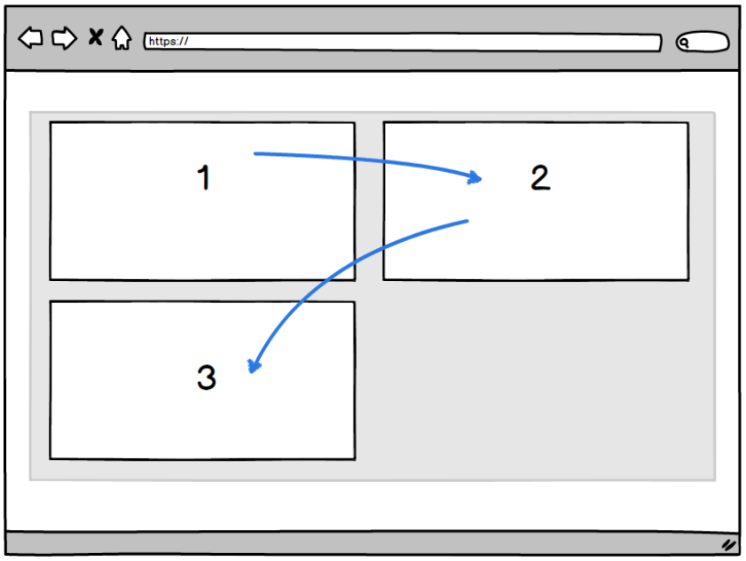
A better method, at least for the important content at the top of the email, would be to use a single column design where the information flows from top to bottom.
An added benefit of this technique is that the email will behave predictably in a mobile device since most mobile email clients will stack your content in the same way.
Uneven text endings
Avoid using justification in your text and instead let the text spacing occur naturally. The uneven spacing and breaks which occur in justified text can create difficulties for some individuals in understanding your message. Letting the text be left aligned and having an uneven ending (or rag) on the right produces a more natural and easier-to-comprehend email.
Avoid Harmful Content
A hot new trend is to insert animated gifs in email messages. While this can be a fun and engaging way to capture your reader’s attention, it is important that these animated images do not contain bright or flashing elements which can cause seizures for photosensitive individuals.
Inclusivity is the Goal
With these six simple practices in mind, you can help ensure that you are crafting your emails so they may be read and enjoyed by the widest audience possible. This is not just a good marketing and fundraising technique but also the right thing to do.
Sources:
http://siteimprove.com/blog/cognitive-web-accessibility/
https://www.usability.gov/what-and-why/glossary/tag/accessibility/
https://www.w3.org/WAI/bcase/soc.html#older
http://www.slideshare.net/RuthEllison/designing-for-cognitive-disabilities/16-Tip_7_be_multimodalbr_The
http://brandongaille.com/8-web-content-accessibility-guidelines-for-email-design/
https://www.campaignmonitor.com/resources/guides/accessibility/
 thedatabank, gbc is technology for change, and we walk the talk.